Title: Framing Bold, Color-Infused Art: Make the Magnificent Stand Out
When diving into the world of mixed media art, the interaction of digital and physical materials results in vibrant, color-infused pieces. The last hurdle to encompass these standout pieces, quite literally, is finding the perfect frame. Yet this shouldn’t be viewed as a mere hurdle, but as the chance to amplify your artwork’s impact.
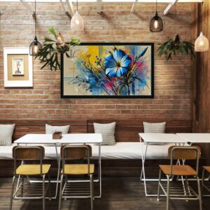
A frame is not just a kiln-edged keeper of the artwork—it’s an extension of the art itself. For pieces heavy on color and abstract designs, such as the ones I create—layered, texture-rich, and often exploring floral motifs—I’ve found that minimalist, monochrome frames often do the trick. They provide boundaries and contrast without competing with the artwork. Consider it like a gust of wind on a hot day, creating a collective sigh of comfort without overshadowing the sun.
On the flip side, if you’re dealing with a vibrant but balanced palette, a frame that picks up a lesser used color in the art can astoundingly elevate the piece. It’s like that surprise ingredient in a gourmet dish—just a hint is enough to intrigue and excite.
Choosing the right frame is just as creative a process as creating the artwork itself. It’s a dance of balance, of knowing when to amplify, contrast, or step back. Even if you feel satisfied with your artwork, remember— the potential for enhancement is always one strategic frame away.
Reflect on your creative process, the hues and textures that dominate your work, and consider how a frame could embrace them. If an artwork is a conversation, then the frame is the eloquence that structures it—ensuring the dialogue flows, takes pauses, and leaves a lasting impact. So make your choice, get your hands messy, and let your creativity encapsulate the magnificent.